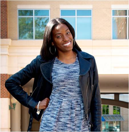
Styled by Keri: Westfield Wheaton Back to School Campaign
If you’ve been following me on social media and/or read my visual merchandising post, you know that I was busy working with Westfield Wheaton over the last couple of weeks. In my visual merchandising post, I described working on the Back to School displays. In this post, I wanted to show you the results of all that hard work (for those that haven’t seen pictures on social media)!
I was tasked with styling mannequins and providing visual input on where and how the Back to School displays should be placed in the mall. Styling included pulling pieces from participating stores to dress the mannequins as well as pull items for the pop-up style suite that took place over the weekend. I also provided insight on the set up and location of the pop-up style suite. What I loved about this project is that I was able to combine both my styling and marketing background.
After spending 9 hours pulling pieces for the mannequins and style suite (read about it here), the first display, the largest of the two, was placed on the second floor right in the middle of the mall. It’s been there for a little over a week and should be up through the end of August. The mannequins are dressed in outfits created from Papaya, XIOS and Aeropostale. The backpacks in the small display cases are from Papaya and Last Stop
The marketing director and I worked together to map out where in the mall the display should go. At first, we were going to split the platforms, but after further consideration it was determined the display would have the most impact if all of the mannequins were together. I didn’t think of the color story while pulling pieces; honestly things came together once I went through the racks of clothes I had selected. From there I decided one platform’s color story would be red, black, and white while the other would be blue and red. Obviously red being the common color between the two. When creating the looks, my goal for the Papaya store was to create outfits you wouldn’t expect to see if you walked in the store. The way Papaya is set up, it reminds you of Forever 21. There’s no way you’d walk in and immediately expect to find the grey skirt outfit or the outfit on the sitting mannequin. I’m not sure you’d immediately expect the first outfit on the right to be from Aeropostale either. They are in the process of re-branding; expect to see more pieces that don’t have their company name plastered across it.
The second Back to School display relied heavily on marketing materials from Westfield so I decided to keep the mannequins simple, using pieces from H&M since it’s located right outside the store. The display features three dresses; two with sweatshirts on top. Layering is always a trend for fall, so that’s one thing I wanted to display throughout all of the display looks.
Along with the Back to School displays, I was also asked to change the G by Guess and Charlotte Russe displays that are located on various ends of the mall. These displays hadn’t been changed in MONTHS. Let me tell you; trying to change mannequins and place them in those glass displays is no easy task! Whew! Please excuse the glare on the G by Guess photo.
I really enjoyed working on my first visual merchandising job. I hope there are more projects to come in the future. After all, Westfield Wheaton is going to need someone to change the large display (6 mannequins) and two display cases when the next season comes along